

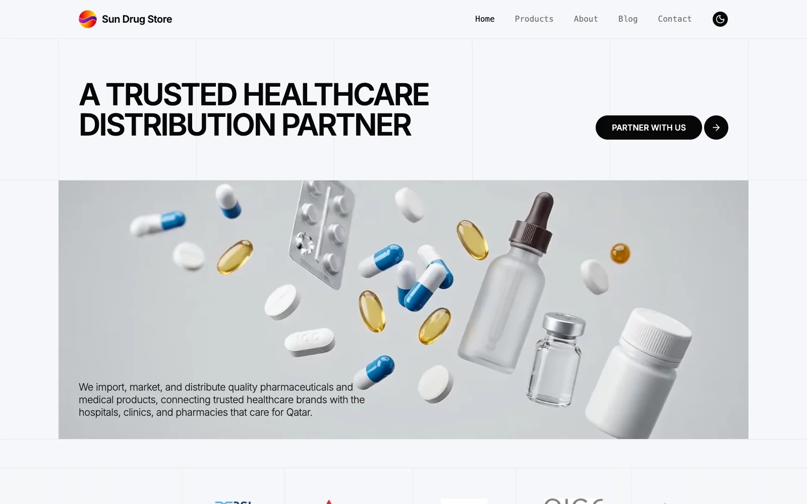
The brief was simple: build a healthcare distribution website. The real job was more important.
Sun Drug Store already had an established network of pharmacy and healthcare buyers in Qatar. Its team met prospects, exchanged business cards, and built trust in person. But when someone scanned the card and looked the company up afterward, the website did not carry that confidence forward.
The company was also entering a new stage. Pharmacies were already a strong part of the business. Hospitals and clinics were the next priority. Sun Drug Store needed a digital presence that made its experience, sourcing model, manufacturer relationships, and product range clear before the next conversation began.
| Project snapshot | Detail |
|---|---|
| Primary engagement | Website strategy, design, and development |
| Additional support | Identity refinement and company brochure |
| Delivery | Three weeks of production, followed by one week of client review |
| Core team | Sudharsan, one frontend developer, and one intern supporting catalogue research, testing, and documentation |
| Client leads | Abdulla Alsayed, Chairman, and Ananth Subramanian, Head of Operations |
| Continuing work | Product updates, blog publishing, and local SEO |
Building the Digital Proof Behind Sun Drug Store’s Hospital Growth
Sun Drug Store did not need a website that made a young business look established. It needed its digital presence to catch up with an established distributor and support the company’s next move into hospitals and clinics.
A website that had to finish the introduction
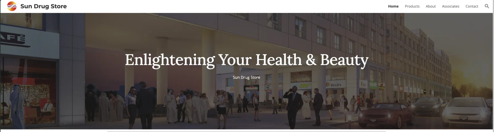
The previous website was a straightforward Google Sites build. It carried basic information, but it did not express the scale or seriousness of the business behind it. The opening visual was generic. The message focused broadly on health and beauty. The product and company information felt disconnected, and the old identity struggled at the exact moment it needed to work hardest: inside a compact website header.
That mattered because the website was rarely the first point of contact. It was the second. People often arrived after a meeting or after scanning a business card. They were already deciding whether the company they had met felt credible enough to continue with.
This handoff matters in B2B buying. In Gartner’s survey of 632 B2B buyers, 69% reported inconsistencies between information on a sales organization’s website and information provided by its sellers. For Sun Drug Store, the website needed to reinforce the meeting rather than introduce a second version of the company.
We did not need to manufacture a new story for Sun Drug Store. We needed to make the existing business easier to understand.
The business behind the interface
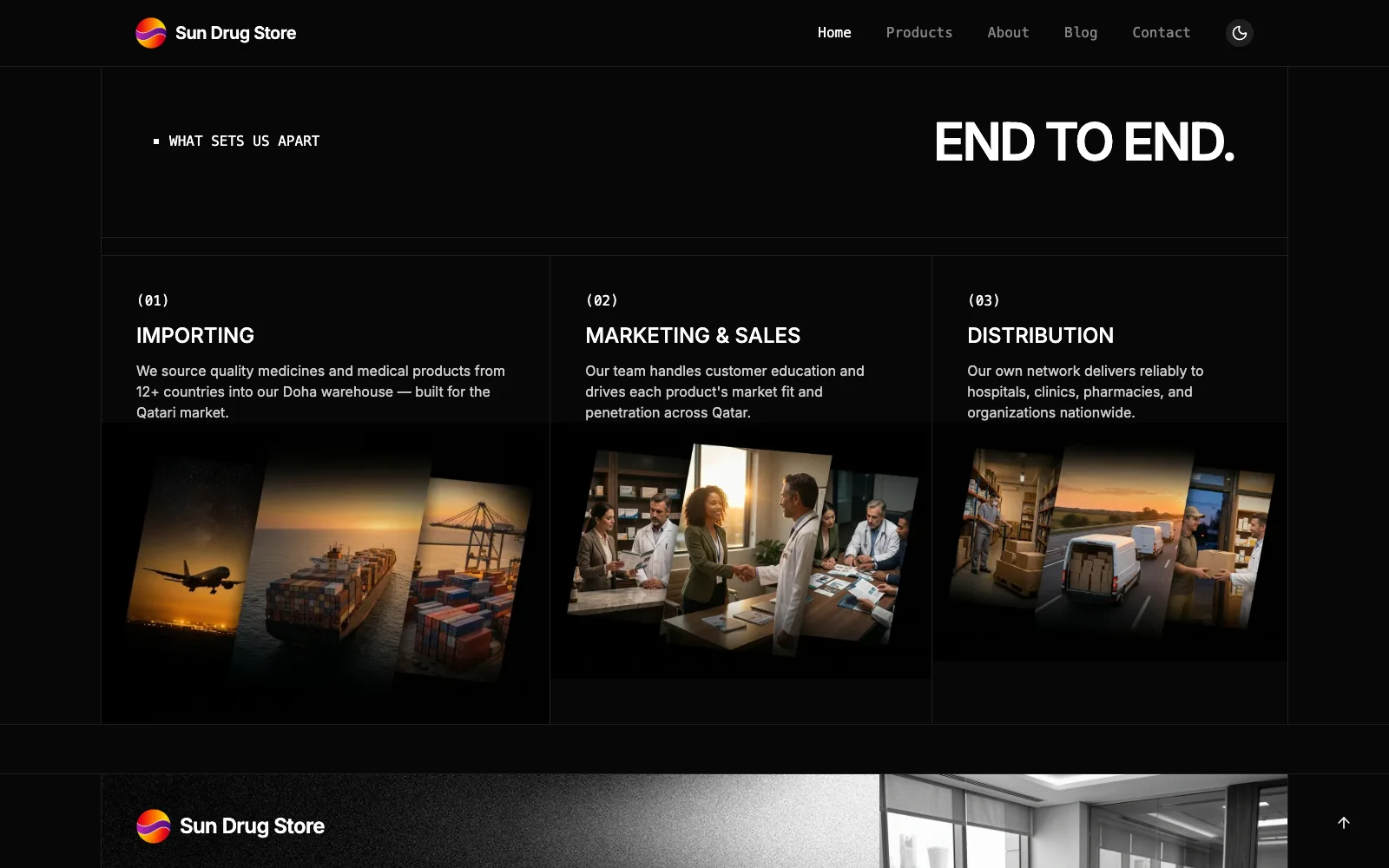
Sun Drug Store described a model built around direct relationships with manufacturers. Its team sources products internationally, manages shipping and paperwork into Doha, and distributes medicines, medical products, and consumables across Qatar. Working directly with manufacturers reduces an intermediary layer between the source and the healthcare buyer.
McKinsey’s 2024 B2B Pulse research, based on nearly 4,000 decision makers across 13 countries, found that B2B customers use an average of ten interaction channels during a buying journey. That made the website a bridge between Sun Drug Store’s meetings, business cards, product research, and enquiries, not a standalone brochure.
The client reported an existing base of about 200 pharmacy and buyer accounts, with products sourced from manufacturers across 12 countries. Those figures gave us useful business context, but the more important insight was qualitative: this was not a new company trying to appear established. It was an established distributor whose online presence had not caught up with the work already happening offline.
Hospitals and clinics also evaluate a distributor differently from a casual retail visitor. They need to understand product breadth, manufacturer relationships, sourcing capability, regulatory awareness, and whether the people behind the company can support an ongoing procurement relationship. The site therefore had to build trust before it asked for an enquiry.
Trust came quickly, responsibility came with it
Sun Drug Store initially had questions about the creative direction. That was reasonable. The website represented a business they had spent years building, and the logo in particular carried a sun concept and colour system they valued.
We responded by showing the work early. By the end of the first week, we presented the homepage. The client approved the direction at that first presentation with only minor feedback. There was no prolonged cycle of competing redesigns. Once the team could see how the identity, content, and interface worked together, the relationship became far more open.
That freedom was valuable, but it was not permission to be careless. Abdulla Alsayed remained the approval decision-maker and corrected important details. Ananth Subramanian coordinated the engagement, kept information moving, and was consistently available when the team needed context. Their responsiveness allowed us to make decisions quickly without disconnecting the design from the business.
The strongest signal was not a formal testimonial. It came in a meeting, when the client expressed how difficult it was to believe the finished experience was their own site. We took that as recognition that the new work finally matched how they saw the company.
Evolving the identity without erasing it
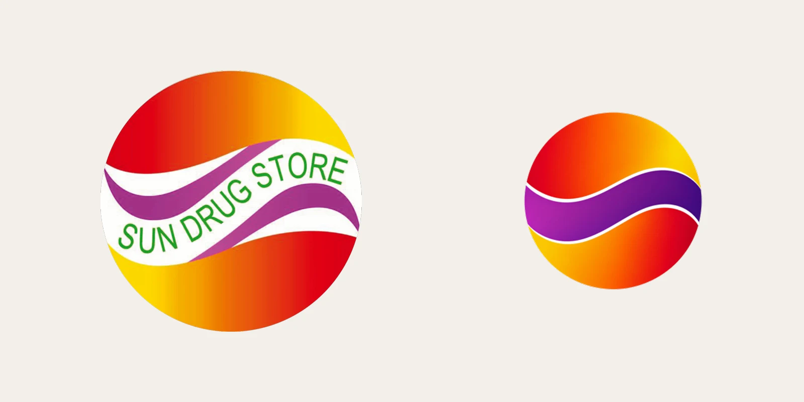
The original logo had two practical problems. The text curved through the centre was almost impossible to read when the mark became small. The white channel inside the symbol also became awkward against dark backgrounds.
A foundational Stanford web credibility study found that visual design cues appeared in 46.1% of website credibility evaluations, including 41.8% of evaluations involving health sites. The study dates to 2002, so we do not treat it as a modern conversion benchmark. Its narrower lesson still applies here: design is part of how people decide whether the organization behind a site feels credible.
The client had initially said they did not want to change the logo. The idea of the sun and the existing colours had meaning, and a lot of thought had already gone into them. We agreed with the instinct to preserve that recognition.
Instead of replacing the idea, we explored two or three restrained refinements internally. The selected version kept the circular sun, warm gradient, and central wave. It removed the unreadable lettering, simplified the contrast, and allowed the company name to sit beside the mark in clear type.
The wider client team only noticed the extent of the refinement when we later delivered the new asset set. Their response was to ask for the files so the identity could be used elsewhere. That was the outcome we wanted: a mark that still felt like Sun Drug Store, only more useful.
From a list of names to a product system
The pharmaceutical product catalogue became the most labour-intensive part of the project.
The client supplied basic spreadsheets, but the information was scattered. In many cases, the starting point was only a product name. The team had to organize the data, locate product imagery manually, research supporting information with AI assistance, and bring each entry into a consistent structure.
We began with five catalogue categories based on the initial material and client guidance. As the products were assembled, some clearly did not belong in the original groupings. Rather than forcing them into the wrong place, we introduced a sixth category.
The intern played an important role here. Alongside testing and documentation, they coordinated product uploads and checked that the information had been assembled in the right places. This was less glamorous than the homepage presentation, but it was essential. A catalogue becomes credible through consistency, not just visual polish.
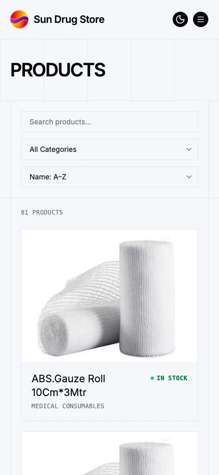
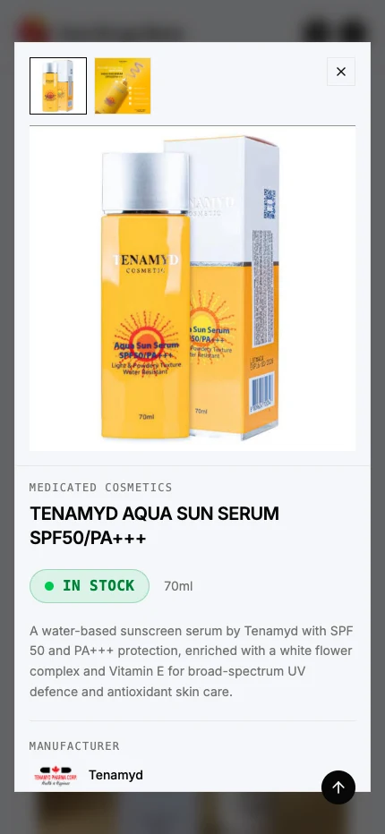
The final public catalogue contains 81 product records across six structured categories. Visitors can search, filter by category, sort by name, view stock labels, and open a detailed product view without losing their place.
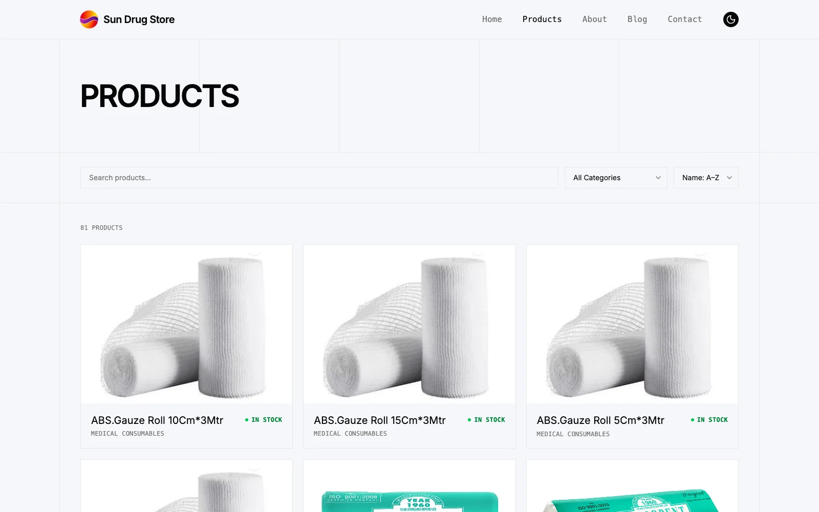
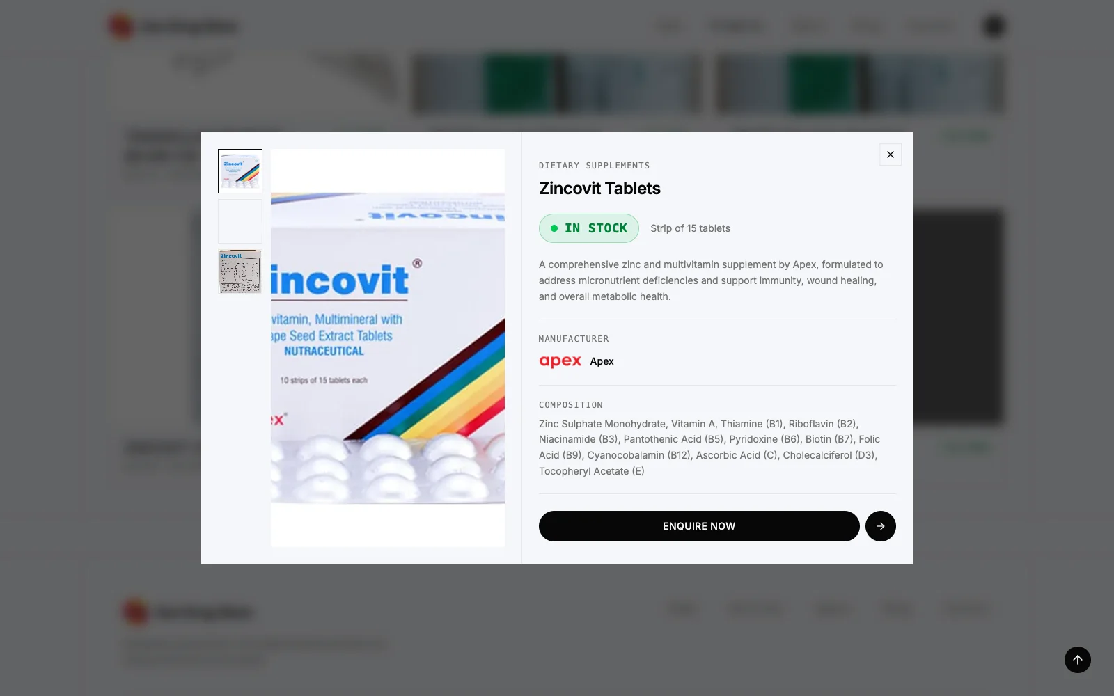
Individual product views bring together imagery, category, pack information, manufacturer, composition, stock status, and a direct path to enquire. Stock is not presented as a live warehouse feed. Sparkable updates it when the client requests a change, typically every three or four months.
Product discovery belongs in the trust story
We did not want the homepage to behave like a company profile with a catalogue hidden somewhere else. Products are part of how a distributor proves its relevance, so discovery needed to begin earlier.
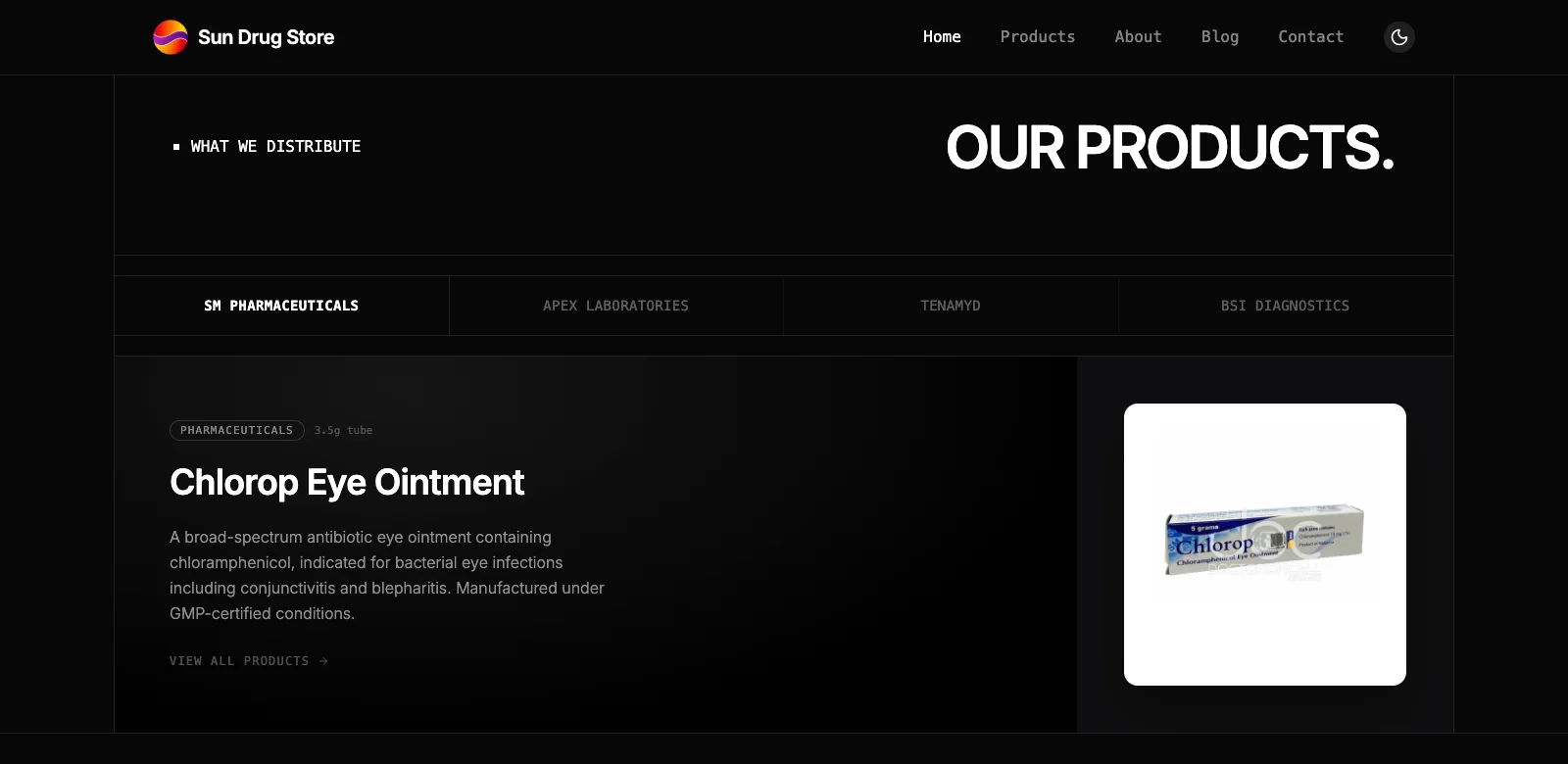
A homepage section groups featured products by manufacturer. It connects three ideas in one interaction: Sun Drug Store has real manufacturer relationships, it carries recognizable product lines, and a buyer can continue into the full catalogue when something is relevant.
This became one of the clearest examples of the project moving beyond a feature checklist. The value was not that we added tabs. The value was that the homepage started answering the next question a serious visitor would naturally ask.
The difficult detail most visitors will never notice
The final homepage intentionally moves between light and dark sections. That contrast gives each part of the story a different pace, but it created a difficult interaction with the sticky header. A header that remained light over a dark section, or dark over a light one, would immediately lose clarity.
We spent time synchronizing the header treatment with the section underneath it. During review, the client initially thought the shift might be a bug and asked to see a uniform light version. We prepared that option instead of trying to explain the tradeoff abstractly.
Once the client saw how the uniform treatment flattened the rhythm of the page, they chose to keep the mixed light and dark experience. The version currently deployed is the approved direction.
This was a useful reminder that a prototype can settle a design question faster than a long defence of the original decision.
A responsive system, not a reduced desktop page
For us, responsive healthcare website design meant making the same trust journey work when someone opened the site directly from a phone. The mobile experience keeps the identity, headline, call to action, partner context, product discovery, and catalogue legible without simply shrinking the desktop composition.
An older Google mobile speed study found that 53% of people would leave a mobile site if it took more than three seconds to load. The research is not specific to B2B healthcare, so we treat it as context rather than a prediction of Sun Drug Store’s visitors. It still reinforces why the mobile experience had to be both clear and fast.
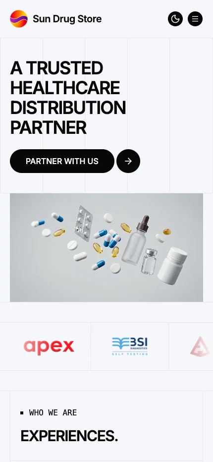
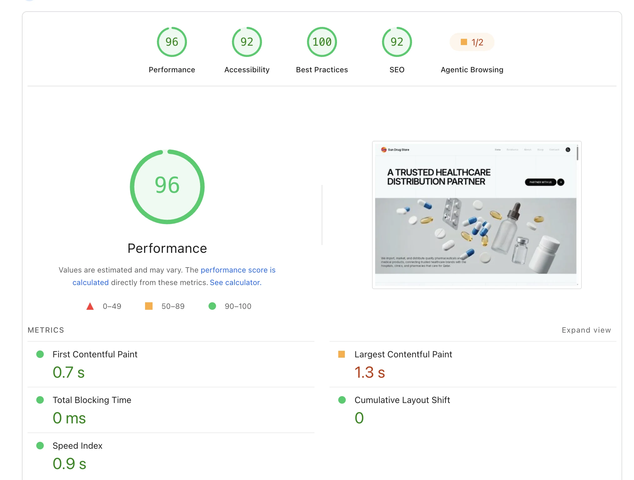
Google’s current Core Web Vitals guidance classifies Largest Contentful Paint of 2.5 seconds or less and Cumulative Layout Shift of 0.1 or less as good. The supplied run sits inside both benchmarks. It is still a lab test rather than field data from real visitors, so we do not present it as traffic, conversion, or production-wide performance evidence.
A CMS the client did not have to manage
We introduced Keystatic to give the catalogue and editorial content a dependable structure. We also asked the client directly whether they wanted access to update products and articles themselves.
They did not. They wanted the information maintained, but they did not want another system to learn or another publishing responsibility added to the team.
So we kept the workflow on our side. Sparkable continues to update product entries, stock information, and blog content as needed. This was not a failed handoff. It was a deliberate service decision based on how the client wanted to work.
Beyond the signed scope
The website was the contracted engagement. The company brochure was not.
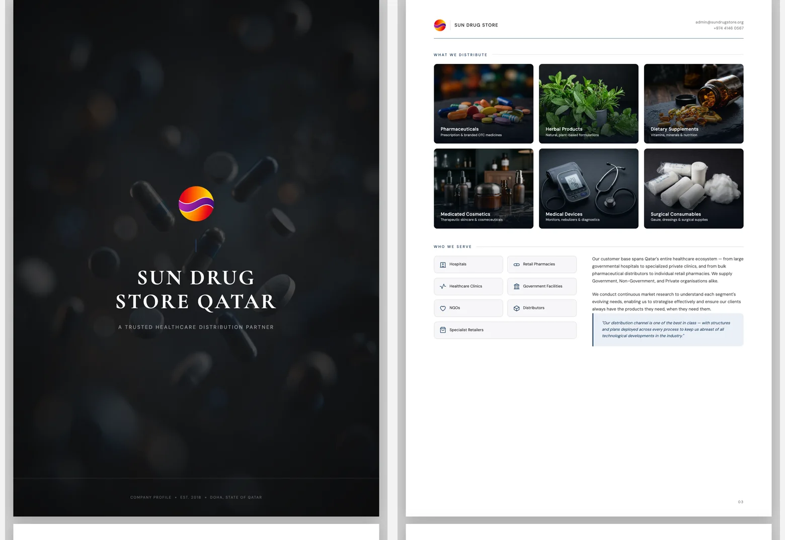
Sun Drug Store needed additional help presenting the same story in meetings and at events, and we were happy to extend the work. The identity, business narrative, product categories, customer groups, and distribution model were translated into a printable company profile.
The brochure was subsequently printed, shared with buyers, and taken to conferences. That adoption matters because it shows the work moving out of a browser and into the client’s actual sales activity.
What changed
The project produced several concrete outputs:
- A live website replaced the previous Google Sites presence.
- A clearer digital identity made the original logo concept usable across light, dark, small, and print contexts.
- An 81-product catalogue made the company’s breadth visible and searchable.
- Product pages connected detailed information with a direct enquiry path.
- A printed brochure extended the system into conferences and sales conversations.
- Sparkable continues to maintain products, publish articles, and support local SEO.
The client also told us that responses after meetings felt stronger once prospects had seen the new website. That feedback is encouraging and fits the original trust problem. We do not yet have analytics that isolate or quantify the effect, so we treat it as directional client feedback, not a measured conversion claim.
What we would do better
Fast approval does not make a project flawless.
We would introduce a structured product-data template at the beginning of a similar catalogue engagement. Starting from consistent fields for category, manufacturer, pack information, composition, imagery, and status would reduce manual normalization and leave more time for content review.
We would also establish analytics at launch. The client can describe a stronger response after meetings, but without a baseline and event tracking we cannot show which pages or actions contributed most.
Finally, we would add a dedicated post-launch link and content audit to the handoff checklist. Small navigation details deserve the same attention as the homepage, especially once a site begins growing through new product entries and articles.
What came next
Sun Drug Store is now positioned online as the established distributor it already was offline. The timing is useful: the company is building on its pharmacy relationships while pushing more actively into hospitals and clinics.
Our role did not end at launch. We continue to publish educational articles, maintain product information, and work on local healthcare SEO so the site can support that next stage over time.
The most important result is not that the website looks more current. It is that a prospect can now move from a business card to the website and encounter the same confidence, specificity, and ambition they experienced in the meeting.