


This website redesign case study explains why Sparkable stopped Lomena Health’s motion-heavy first build and replaced it with a clearer, mobile-first, modular website system.
The first version looked expensive. It gave every therapy a dramatic stage, moved like a design reel, and contained several screens we still like.
It was also slow in places, inconsistent across pages, and weak on a phone. More important, it did not explain Lomena’s business clearly enough. The site had started to become a collection of attractive moments instead of one useful customer journey.
I stopped the direction.
That decision meant accepting sunk effort, asking the team to begin again, and showing the client a simpler alternative before we could promise that the restart was right. It also gave us the chance to keep the strongest parts of the brand and rebuild the website around the business Lomena was becoming.
This is the story of why we restarted, what we changed, and what Sparkable learned about using speed at the right point in a project.
| Project snapshot | Detail |
|---|---|
| Client | Lomena Health |
| Client lead | Suvedhanan Thirumurugan, CEO |
| Business stage | New wellness therapy centre under development |
| Initial website scope | About 20 pages, with more services added during the project |
| Sparkable team | Sudu as project manager, one UI and UX designer, one full-stack engineer, and supporting front-end engineers |
| Work | Brand direction, visual identity, website strategy, responsive design, modular front-end development, and booking interface |
| Technical direction | TanStack Start with structured service data and reusable page sections |
| Verified outcome | The client approved the rebuilt direction, and the team could respond to changing services through one shared page system |
| Evidence boundary | The site had not launched at the time of writing, so this case study makes no traffic, conversion, booking, or patient outcome claims |
This account combines the two working codebases, Git history, design files, browser testing, and Sudu’s first-hand record as project manager. We distinguish completed work from planned integrations. We also avoid medical claims that have not received the right clinical review.
Why did Lomena need a wellness website redesign?
Lomena Health is building a wellness therapy centre. The positioning sits between two categories people already understand.
It is not a spa. The experience is not meant to frame therapies as occasional indulgences or beauty treatments. It is also not a conventional clinic. Lomena wants a softer setting for people exploring guided recovery and proactive wellness.
The planned service mix includes infrared light therapy, multispectrum sauna, cold plunge, and nutrition IV support. The wider business intends to support people interested in recovery, ongoing health checks, and medically adjacent wellness services. Those subjects require careful language. A website can explain what a service is and how a visit works without promising a clinical result it cannot prove.
That distinction shaped the brief. Lomena needed a wellness website that could educate an unfamiliar audience, earn trust, and help a visitor choose a sensible next step. The brand also needed enough warmth to avoid the sterile feel of a hospital website.
The visual problem sounded simple until we tried to solve it. Many wellness brands lean on spa photography, muted beige palettes, and broad claims about feeling better. Many health websites lean on white coats, dense terminology, and institutional blue. Lomena wanted neither template.
Our working idea joined scientific structure with visual references to water, light, and nature. That idea influenced the colour, the softness of the shapes, the image direction, and the way information moved from explanation to action.
Trust was not an abstract design concern. In Stanford’s study of 2,684 people across 100 websites, design look appeared in 46.1% of credibility comments. Information structure appeared in 28.5%, and information focus appeared in 25.1%. The study dates to 2002, so it is not a modern conversion benchmark. Its narrower lesson still matters: visual polish, structure, and focus work together when people form an early judgement about a website. Read the Stanford web credibility study.
Our wellness clinic website design guide covers that trust problem at category level. Lomena gave us a real project in which the brand, the physical centre, the service information, and the website all had to agree.
The brief grew while the physical centre took shape
Lomena was a new company and did not have an existing website. Suvedhanan Thirumurugan came to Sparkable with a clear view of the services he wanted to offer. The first estimate covered about 20 pages.
The business did not stay at that size.
As work on the physical centre continued, Lomena added services, packages, and future product ideas. Finding specialists and completing the centre also took longer than the client first expected. There was no fixed client deadline, but our team initially worked with more urgency than the situation required.
That mismatch mattered. We began planning several pages while the service list was still changing. A page approved on one call could need a different structure after the next. Designing every page in detail felt productive, but much of that planning had a short life.
The project did not need us to move slowly. It needed us to decide what should remain stable while the business changed.
The stable parts were the brand principles, the overall page hierarchy, and the reusable sections. Individual service content could stay flexible.
Why did the first website design need a restart?
The original repository records 95 commits between February 5 and June 9, 2026. That history includes exploration across motion, home sections, service pages, packages, navigation, booking, FAQs, responsive behavior, and many visual alternatives.
The work was substantial. It was not a careless first draft.
The main experience used large photography, full-screen transitions, animated type, scroll effects, and therapy-specific scenes. Individual screens could look polished enough to stand alone. The problem appeared when we reviewed the website as one system.
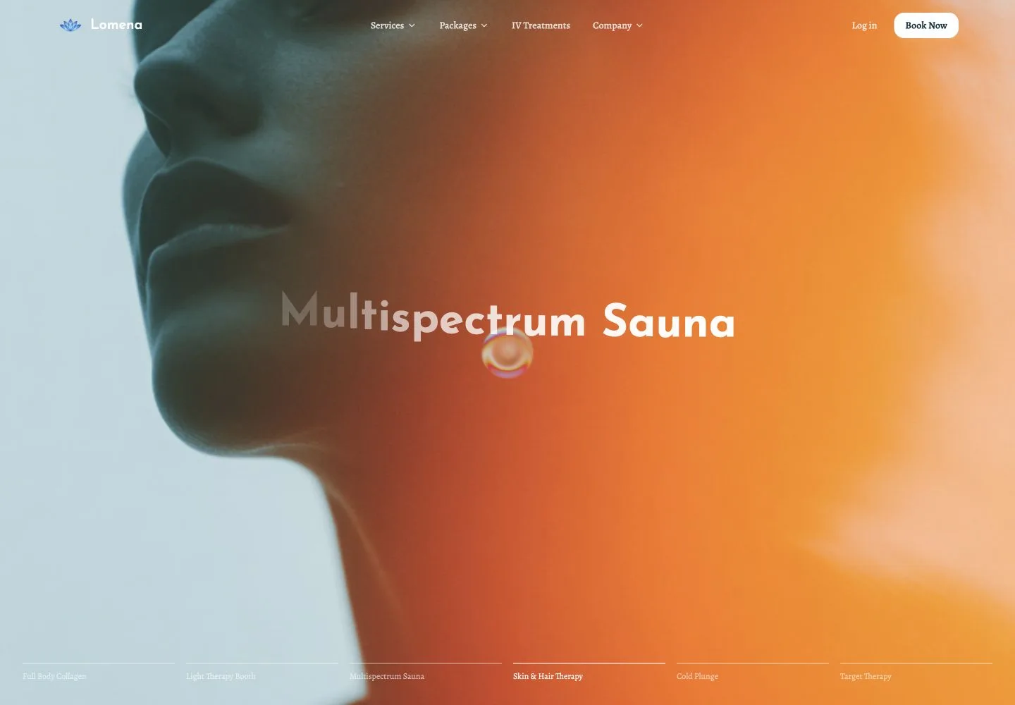
Different pages had begun to develop their own visual rules because several people were working on different parts. Motion sometimes slowed the interface or introduced bugs. The navigation, content density, and calls to action did not always agree on what the visitor should do next.
A website can look designed and still make the business harder to understand. That was happening here.
McKinsey’s Design Index helps explain why visual ambition alone was not enough. The firm tracked 300 public companies over five years and recorded more than 100,000 design actions. Companies in the top design quartile recorded 32 percentage points more revenue growth and 56 percentage points more shareholder-return growth than their industry peers. McKinsey linked that performance to four wider practices: measuring design, joining physical and digital experiences, working across functions, and testing with users. Read McKinsey’s design research.
Those figures are broad correlations, not a forecast for Lomena. The useful comparison is the process. Our first direction had visual ambition, but the pages did not yet share one business goal, one interaction system, or one review process.
The first direction also carried too much activity. A visitor had to process the image, the transition, the service selector, the heading, the description, and the navigation at once. Lomena needed to explain an unfamiliar category. The design was demanding attention before the content had earned trust.
We did not have conversion data because the site was not live. We therefore cannot say that the first version failed to convert. We can say that its hierarchy and next actions were less clear than the brief required.
Why did mobile-first website design become a deciding factor?
The desktop experience had enough space to carry the motion. The mobile version exposed the cost.
At a 390-pixel viewport, the first build exceeded the visible width and split a service title in the middle of a word. The full-screen photography remained striking, but the heading, navigation, and supporting copy competed inside a much smaller frame.
Google reported that 53% of mobile visitors left a site when loading took longer than three seconds. The 2016 benchmark covered 3,700 mobile websites that shared anonymized analytics. It is a dated, general benchmark and not a Lomena result, but it explains why heavy motion and weak responsive behavior could not be treated as small finishing issues. Read Google’s mobile performance report.

This was more than a breakpoint issue. We could have repaired the wrapping, reduced the type, and removed individual effects. The larger question would remain: why were we preserving a direction that no longer matched the business goal?
Incremental fixes would also leave us carrying technical debt from experiments that the final site no longer needed. We would spend time upgrading, cleaning, and working around decisions made for a different direction.
Restarting gave us a clean boundary. It let us choose what deserved to survive.
Why did we restart instead of polishing the first build?
The client had not rejected the first version. In meetings, the response was often that the work looked good. I still sensed that the approval was not complete.
About half the website contained impressive moments. The other half did not have the same purpose or finish. There was always a lot happening, and the client did not respond to every section with the same confidence.
I did not begin with a long presentation about everything that was wrong. I worked with our UI and UX designer on a few sections in a simpler direction. We took those sections to the client and showed the difference.
The client approved the new direction immediately.
“I could sense the direction was wrong. I am a strong believer in ‘less is more’.”
Sudu, Sparkable project manager
That approval mattered because a restart transfers risk back to the team proposing it. We were not asking Lomena to accept less because the first build was difficult. We were accepting that our process had produced the wrong system and offering a better one.
The hardest conversation was internal. The team had invested real effort, and starting again can make useful work feel wasted. In practice, the team understood the decision. Contributors had also felt the misalignment between pages. Once we agreed on one complete design and a fixed sequence, the work became smoother.
The discarded version still mattered. It taught us what motion added, where it became noise, which brand choices held together, and where a page-by-page process broke down.
When should a website be restarted instead of improved?
A restart makes sense when the main problems come from the shared structure, technical base, or business direction. Isolated defects usually deserve isolated fixes.
| Improve the current website when | Consider a restart when |
|---|---|
| The brand and business positioning still fit | The website expresses the wrong category or business model |
| Most pages share one clear hierarchy | Important pages follow competing visual and interaction rules |
| Mobile issues are limited to a few components | Mobile requires a separate rescue across the whole experience |
| Performance problems have known causes | Old experiments and technical debt slow every new change |
| The team can add content without workarounds | Each new page requires another custom layout or exception |
Lomena matched most of the restart signals. We still kept the parts that worked: the identity, the typography, the core palette, and some header decisions. Restarting the system did not mean discarding all earlier thinking.
What did we preserve from Lomena’s brand?
We did not restart the brand.
The UI and UX designer had already led a strong identity process across the logo, typography, palette, and wider visual language. The work began with circles, curved forms, and soft geometry rather than a request to draw a specific lotus. The final mark brought those shapes together in a form that felt open and calm.
We avoided red and hard-edged layouts. The palette used Tailwind’s blue and cyan families, led by blue-800, blue-900, and cyan-500. The deep blue felt more specific than a generic corporate blue, while lighter tones kept the experience open.
Josefin Sans gave headings a clean, deliberate shape. Alegreya brought more warmth to longer copy. The contrast helped us hold science and nature inside one visual system without turning either idea into decoration.
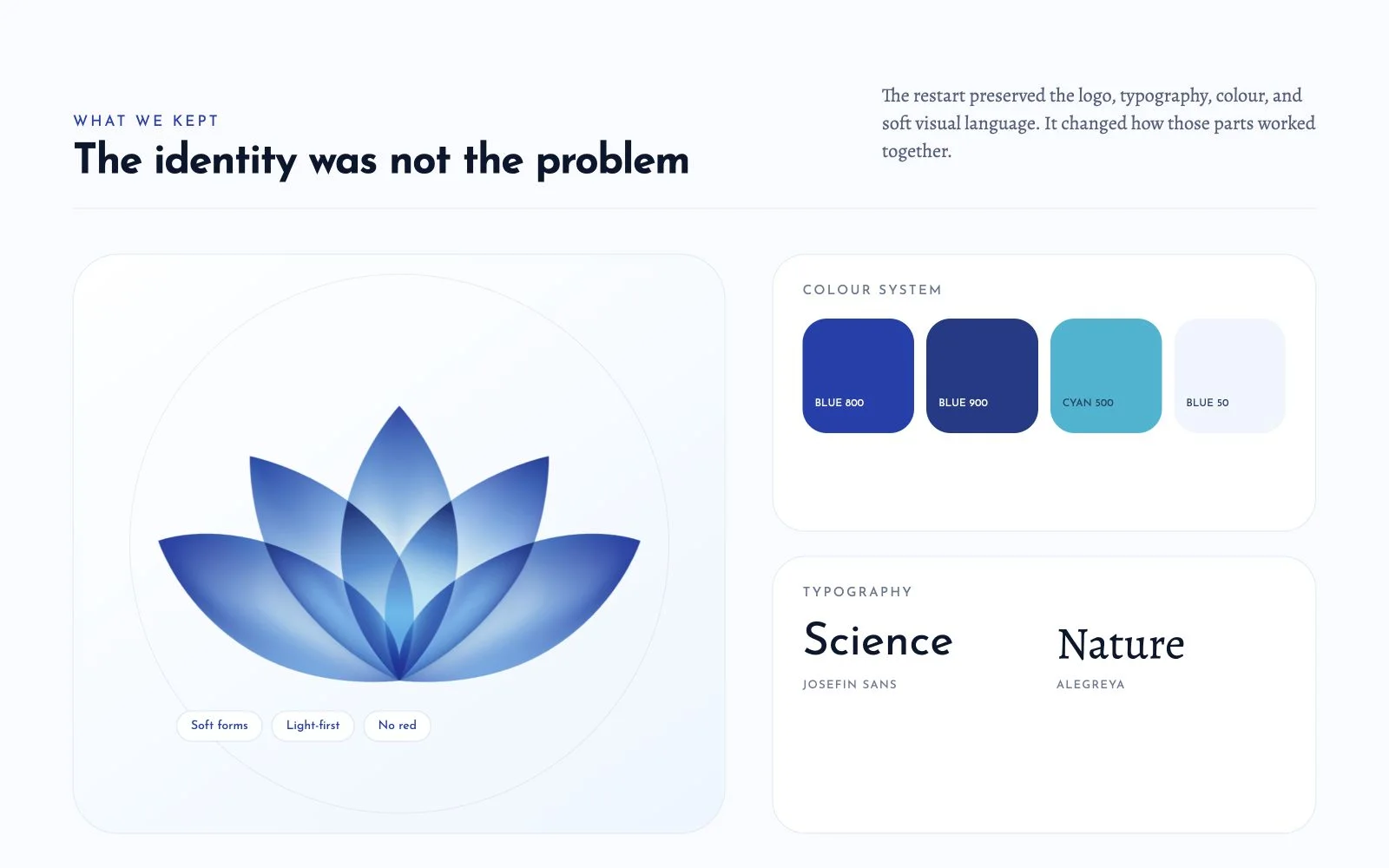
The second design became light-first. It still used deep blue for selected sections and service-page contrast, but the overall experience relied more on space, type, and calm transitions. We treated motion as a finishing layer after the page worked without it.
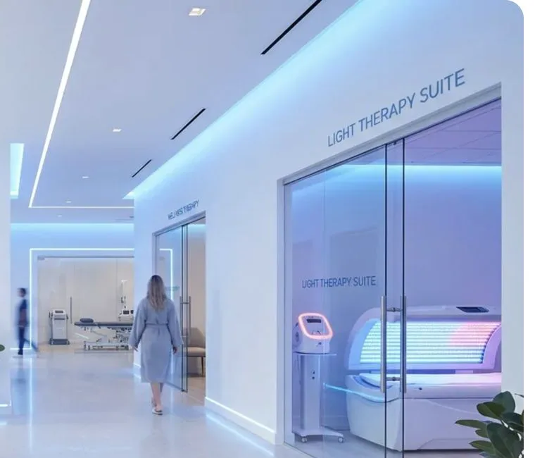
The image direction also changed. The rebuilt prototype currently contains generated concept imagery. One source image included another brand name, so we excluded it from this case study. Lomena plans to replace the concept images with photography and video from the completed centre.
The image below is a cropped concept frame. It shows the lighter visual direction without presenting the generated brand name or draft medical statistics as approved content.
How did one complete page improve the process?
Our main process correction happened before the next round of development.
The first time, we used whiteboards, partial mockups, and direct implementation to move fast. Those shortcuts worked while one person held the context. They failed when several contributors interpreted the same brand across many pages.
For the restart, Sudu and the UI and UX designer completed one representative page before expanding the design. We reviewed the full page as a system. The team could see the spacing, type scale, section order, card treatment, navigation, calls to action, and mobile behavior together.
That one page became the reference.
We then compared other pages side by side in Figma. Repetition became easier to spot. If one service page invented a new card, a new heading treatment, or a new CTA style without a business reason, the difference was obvious.
The process removed a common source of waste. We no longer had several developers solving the same design question in several ways.
How did modular web design make ten service pages manageable?
The technical rebuild followed the same principle.
Lomena did not need a large CMS for this phase. The site had a fixed budget, a known family of service pages, and frequent changes that arrived through direct calls with the client. We needed a structure the development team could update quickly without giving every therapy a separate code path.
The rebuilt repository defines ten therapies as structured content objects. A shared TanStack route reads the service slug and assembles the relevant sections. Those sections include the hero, process, overview, benefits, conditions, and FAQs when the service provides them.
Nielsen Norman Group defines a design system as standards for managing design at scale through reusable components and patterns. It highlights reduced redundancy, shared language, and visual consistency as the practical benefits. Lomena did not need an enterprise design system, but the same principle applied at a smaller scale. One reviewed service-page pattern gave the team a shared language and stopped each page becoming a new design project. Read Nielsen Norman Group’s design systems guide.
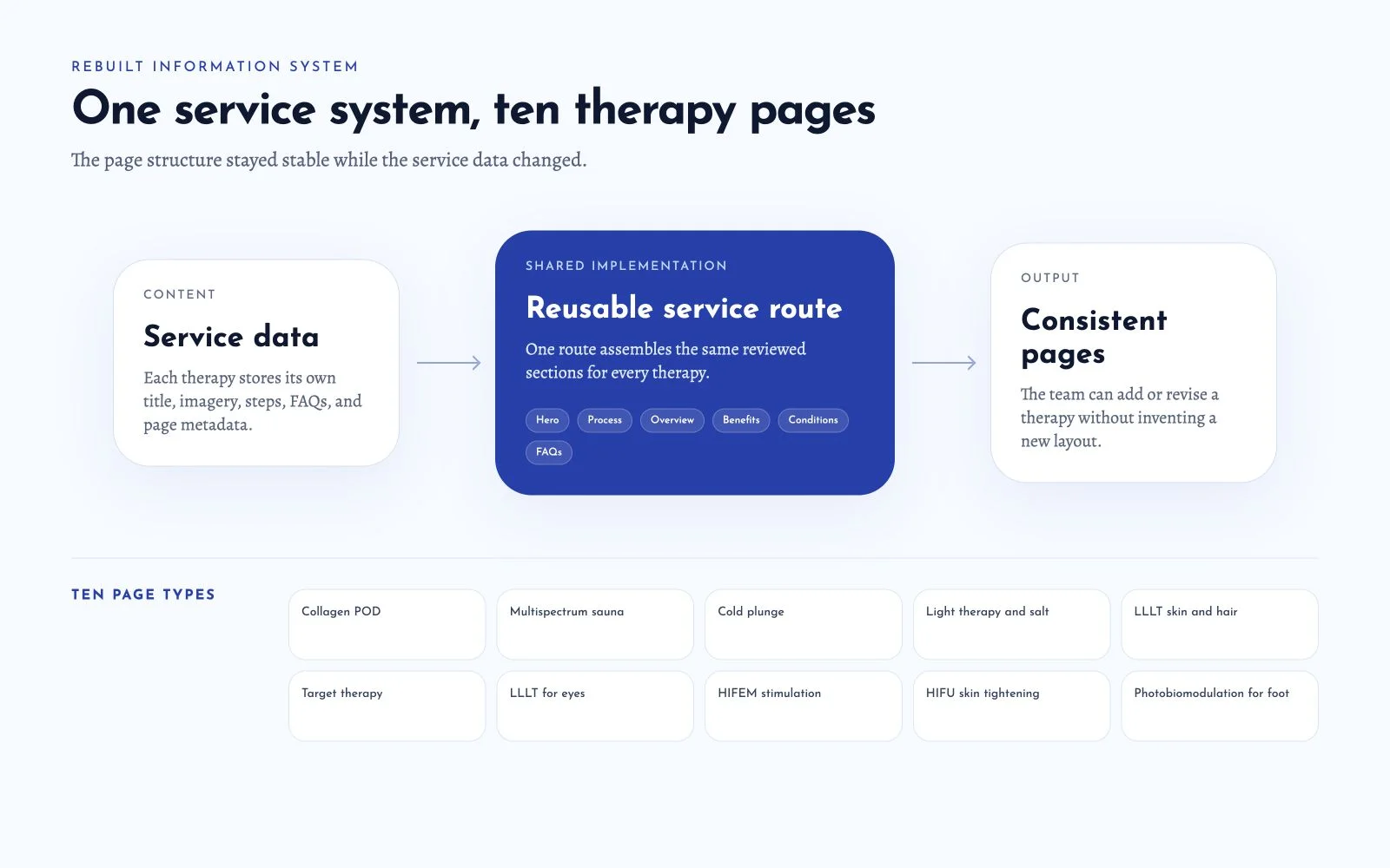
This structure changed the cost of a client update. Adding or revising a therapy no longer required a new layout discussion by default. The team could update the data, review the result inside the shared page, and focus design time on differences that mattered.
The repository history makes the change visible. The newer build began with an initial website commit on April 28, 2026. A single sauna detail page followed on May 23. On May 26, the team extended the shared template across all ten therapies, compressed images to WebP, improved responsive behavior, added metadata, and connected booking calls to one route.
Commit history does not measure design quality. It does show that the rebuild moved from one approved pattern to a broader system instead of producing ten unrelated pages.
Why did TanStack fit the longer product roadmap?
The framework decision also reflected discussions beyond the marketing site.
Lomena wants the booking experience to connect to a CRM in a later phase. The client has also discussed a custom CRM and a mobile application. Those products would need to share service, customer, and appointment concepts over time.
We chose TanStack Start because the website was likely to become one part of that wider product work. The decision gave the team a React and TypeScript base that could support richer application behavior without rebuilding the front end around a new model later.
That roadmap is not finished functionality.
The current booking page is an interface prototype. Submitting it changes the local screen state. It does not create an appointment or send data to a CRM. We describe the integration as planned work because calling the current interface a completed booking system would be inaccurate.
The same care applies to service copy. Sparkable researched scientific subjects because the client supplied only a basic starting point. Research helped us structure pages and questions, but medical content still needs review by the appropriate client and clinical experts before publication.
What did the redesigned mobile experience change?
The rebuilt mobile hero removes most of the desktop complexity. It keeps the logo, one headline, one action, and a restrained image treatment. The page no longer asks the mobile visitor to navigate an animated service carousel before understanding the brand.
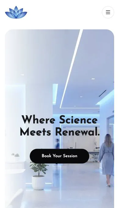
This is a design outcome we can verify in the working build. It is not a business outcome by itself. Better hierarchy may support future conversion, but only launch data can tell us how real visitors respond.
A Nielsen Norman Group case study shows why hierarchy should be measured rather than assumed. In a separate B2B redesign, researchers tested navigation with 64 participants. A revised information architecture raised the tree-test score from 4.0 to 7.4 out of 10, an 85% increase in findability. That machinery website and Lomena serve different users, so the figure does not estimate Lomena’s future performance. It provides evidence for the design principle: fewer competing choices and clearer categories can make complex services easier to find. Read the Nielsen Norman Group case study.
Our healthcare website design guide explains the wider responsive and trust considerations for medical-adjacent websites. The Lomena build demonstrates how we applied those ideas without presenting the business as a conventional clinic.
The team also remembers strong Lighthouse results across performance, accessibility, best practices, and SEO. We do not publish those scores here because we do not have the dated report and test conditions needed to reproduce them. A number without its URL, device profile, run date, and environment would add confidence without adding proof.
What did the website redesign actually deliver?
The project produced clear outputs:
- A rebuilt homepage and navigation system
- A responsive mobile direction
- Ten data-driven therapy pages using one shared route
- Reusable page sections for common service information
- WebP image assets and page metadata
- One booking route ready for later integration work
The verified outcomes are narrower and more useful:
- The client approved the new direction after seeing a small set of representative sections.
- The team stopped inventing a separate visual system for each page.
- Service changes became easier to handle because content and layout were separated.
- Mobile hierarchy became a first-order design decision instead of a later repair.
- The brand moved beyond the website into discussions about signage, interiors, brochures, and video.
- Sparkable and Lomena continued working together beyond the original website scope.
We do not claim that the site increased traffic, generated bookings, improved recovery, or changed patient behavior. The public launch and the connected booking system were still ahead at the time of writing.
We also do not include a client testimonial. The client approved the direction in person, but we do not have an approved written quote that can be reproduced accurately.
The work continued outside the browser
The relationship with Lomena was unusually physical for a website project.
I often went to the client’s location with my laptop and reviewed the work in person. Those conversations expanded into colour and interior decisions as the centre took shape. The logo and visual system then influenced printed material, brand assets, and future video direction.
That connection gave us useful context. A colour that looks calm on a screen also needs to work on a sign, in a treatment room, and beside the materials used inside the centre. A logo that works at the top of a website needs to remain legible when produced physically.
Photographs of the finished location will provide stronger evidence of that outcome. We will add them only after the centre is ready and the client clears the images for publication. Until then, this case study treats the physical application as a first-hand project account, not a photographed result.
What would we do differently on the next website redesign?
The first process did not break down because Sparkable moved fast. It broke down because we moved before the team and the client had one stable page system.
We would change five parts of the process:
- Complete one representative page first. The page must show the full hierarchy, content density, interactions, and responsive behavior.
- Review related pages side by side. This reveals accidental differences before they enter the codebase.
- Delay low-priority pages while the scope is changing. A page that depends on an unsettled service should remain light until the service is clear.
- Separate content from layout early. Structured service data lets the client revise an offering without reopening every design decision.
- Add motion after the static experience works. Animation can strengthen hierarchy, but it cannot create hierarchy on its own.
The direct-coding shortcuts in the first phase felt efficient. They also allowed page-level decisions to spread before anyone had reviewed the whole system. Figma was not valuable because every project needs more design files. It was valuable because the team needed one place to compare the pages before building them.
What should founders take from this website redesign case study?
Sparkable works well with startups because we can move from discussion to a working interface quickly. That strength remains part of how we work.
Lomena taught us to ask one more question before using it: is the client describing a settled decision, or a business that is still discovering the decision?
When the answer is unclear, we now keep uncertain pages modular and give the representative page more attention. Once the direction is approved, speed becomes useful again. The Lomena rebuild moved faster because the team no longer had to debate the design language inside every section.
I think of the project as a yin and yang lesson. Speed and restraint were both necessary, but they belonged at different points. We needed restraint while the system was unclear. We needed speed after the client approved it.
The strongest result was not that we rescued a difficult website. It was that Lomena trusted us to say the first direction was not good enough, show a better one, and keep helping as the business moved from plans into a physical place.
If your website looks polished but no longer fits the business behind it, the first decision is whether to repair the current system or replace it. Sparkable can help you make that decision before another round of design and development. Tell us where the website is stuck.
Sources and further reading
- How Do People Evaluate a Web Site’s Credibility?, Stanford Persuasive Technology Lab
- The business value of design, McKinsey & Company
- Progressive Web Apps: The New Standard for Web Interactions, Google
- Quantifying UX Improvements: A Case Study, Nielsen Norman Group
- Design Systems 101, Nielsen Norman Group
Frequently asked questions
Why did Sparkable restart the Lomena website?
Sparkable restarted because the first website’s shared structure no longer matched Lomena’s business goal. Individual screens looked strong, but motion, mobile behavior, inconsistent page patterns, and unclear next actions weakened the experience as a whole.
What should a wellness website include?
A wellness website should explain the service category, establish who provides the service, describe what a visitor can expect, and offer one clear next step. Medical-adjacent claims also need qualified review and visible evidence before publication.
How did mobile-first design change the Lomena website?
The rebuilt mobile opening keeps the logo, one headline, one primary action, and a restrained visual. It removes the animated service carousel from the first decision and lets the wider catalogue appear after the visitor understands the brand.
What does modular web design mean in this case study?
Modular web design means that ten therapy pages share one route and a reviewed set of sections. Each therapy keeps its own structured content, while the page hierarchy, components, and interaction rules stay consistent.
How do you redesign a website when the scope keeps changing?
First, complete one representative page and agree on the parts that must remain stable. Then separate changing content from the shared layout, delay low-priority pages, and review related screens side by side before development expands.
Can a conversion-focused website redesign guarantee more leads?
No. A conversion-focused redesign can improve hierarchy, clarify calls to action, and remove friction, but only post-launch analytics can show whether leads increased. This case study reports the design and workflow outcomes we verified and makes no conversion claim for Lomena.