

Which shadcn UI libraries do I recommend?
I would start with Efferd for clean, reusable blocks and Shadcn Space for the more colorful websites and dashboards I like building. Shadcn UI Kit is worth a look for its changelog layouts, Shadcn Studio has a broad paid collection, and Launch UI has some of my favorite-looking SaaS landing pages. The right choice depends on the actual page you need and what the download includes.
If you already know what you need, jump to the free shadcn landing page templates or the free vs. paid pricing comparison.
I’m Sudu, the founder of Sparkable. I’ve built around 100 websites for clients around the world, and I still get excited when I find a good component library. There is no prize for building the same navigation menu from scratch for the twentieth time.
I want to spend that effort on what makes the website feel right for the business. The content. The flow. The details that make someone understand the product and want to use it.
This is my shortlist from the video below, including what I liked, what frustrated me, and where I would spend my own money. I paid for Shadcn Space’s $99 lifetime plan and have spoken with its founder about the roadmap. I also tried Launch UI’s free download. Those experiences shape my opinions here. This is a personal review of the tools I showed, not a benchmark of every shadcn library on the internet.
Jump to a library in the video
Why I start with shadcn/ui before choosing a library
With shadcn/ui, I can bring the component source into my project and change it directly. That is the part I care about. I can start with a working button, dialog, or navigation pattern, then adjust it to fit the product.
I call it a component library in the video because that is the easiest introduction. The official shadcn/ui documentation makes a more precise distinction: it provides components and a way to distribute their code so you can build your own library.
What are shadcn components, blocks, and templates?
Shadcn components are individual UI elements, such as buttons and inputs. Shadcn blocks combine components into sections, such as a pricing section or login form. Shadcn templates combine sections into a page or a larger website starting point. I compare them separately because a thousand button variants and ten complete landing pages solve different problems.
How I choose the design direction
My first stop is the shadcn project builder. Before I collect sections from other sites, I want a feel for the overall direction. In the video, I change the base and theme colors, look at cards and charts, and try different fonts. I move from an olive and lime direction to a cooler palette while thinking about a healthcare website.
That is a design exercise, not a rule that healthcare websites have to be blue. I want to see the choices together before I start assembling pages. I also try alternatives to Inter because I see it everywhere. A heading font can change the character of the same layout quite a bit.
The point is to settle on a direction early. If every section arrives with its own font, radius, and color choices, I have created another design problem. I cover that thinking in more detail in my article on brand strategy before design.
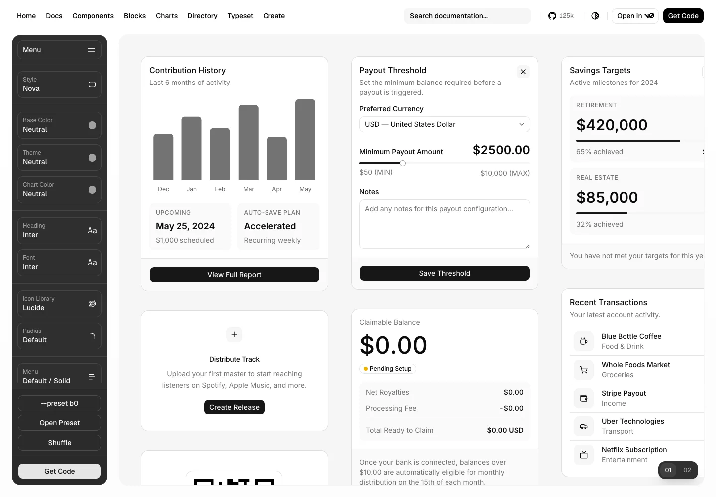
Shadcn UI Kit: I would come here for the changelog layouts
Shadcn UI Kit caught my attention because of its changelog pages, hero sections, and pricing layouts. The changelog collection is the part I would personally come back for.
In the video, I am fairly lukewarm about the dashboards. They did not stand out to me as much as the other pieces. I would buy it for the smaller page layouts first.
A changelog page is a good example of a small design task that can eat more time than it deserves. I want updates to be readable and easy to browse, with a layout that still feels like the product. Starting from a layout I already like gives me something concrete to adapt.
I would look at the free examples first, then decide whether a specific paid layout justifies the purchase. If several people on a team need the same collection, the team license also becomes a different decision from buying access for myself.
My preference here is for the simpler layouts. If you want a restrained visual direction, this is one of the places I would browse. If you want something with more color and personality, my next two picks are more interesting to me.
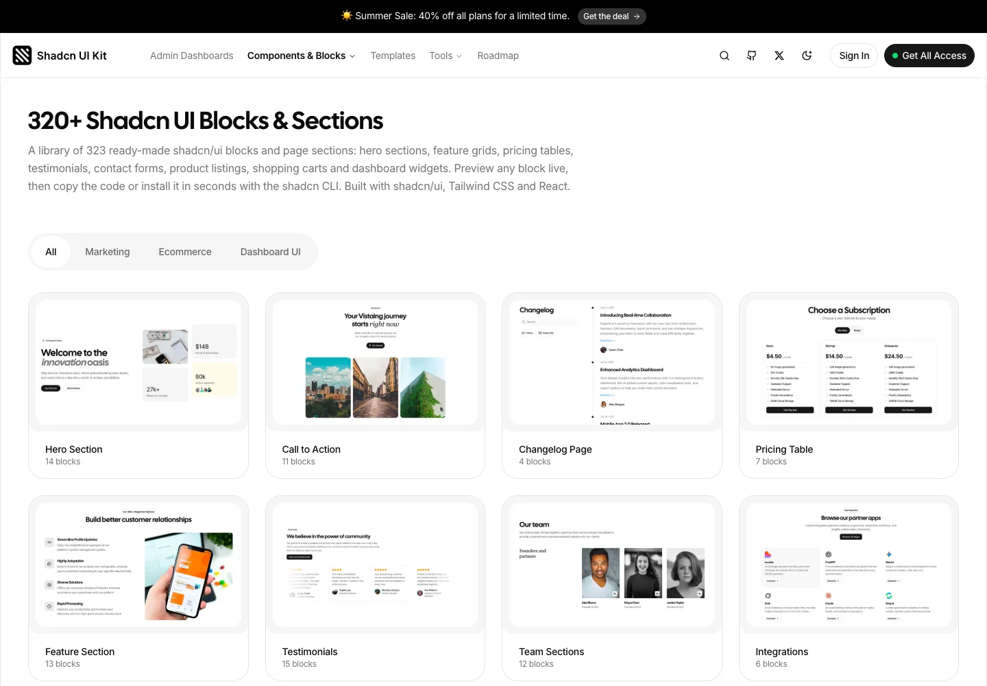
Efferd: the one I was happiest to discover
Efferd is the library I was most excited to show because it took me longer to find. Once I found it, I kept exploring.
I particularly enjoy its navigation and authentication layouts. In the video, I go through the free and paid hero sections, switch to dark mode, and try an app shell. The dark versions are my favorite. They have the sort of finish that makes me want to build something around them.
I also like being able to see the code and use the install command from the block. A preview is useful, but I want to get into the actual component and work with it.
The app shell was new to me during the recording. I changed its colors and font to see how it would look with a different setup. That is a useful test of any library: do I still like the layout once it has my own design choices in it?
Efferd would be one of my first stops for a website or application where I need a few well-designed sections. I would start with the free blocks and only pay when I know which premium pieces I want. I would not buy a large collection purely because the previews look good.
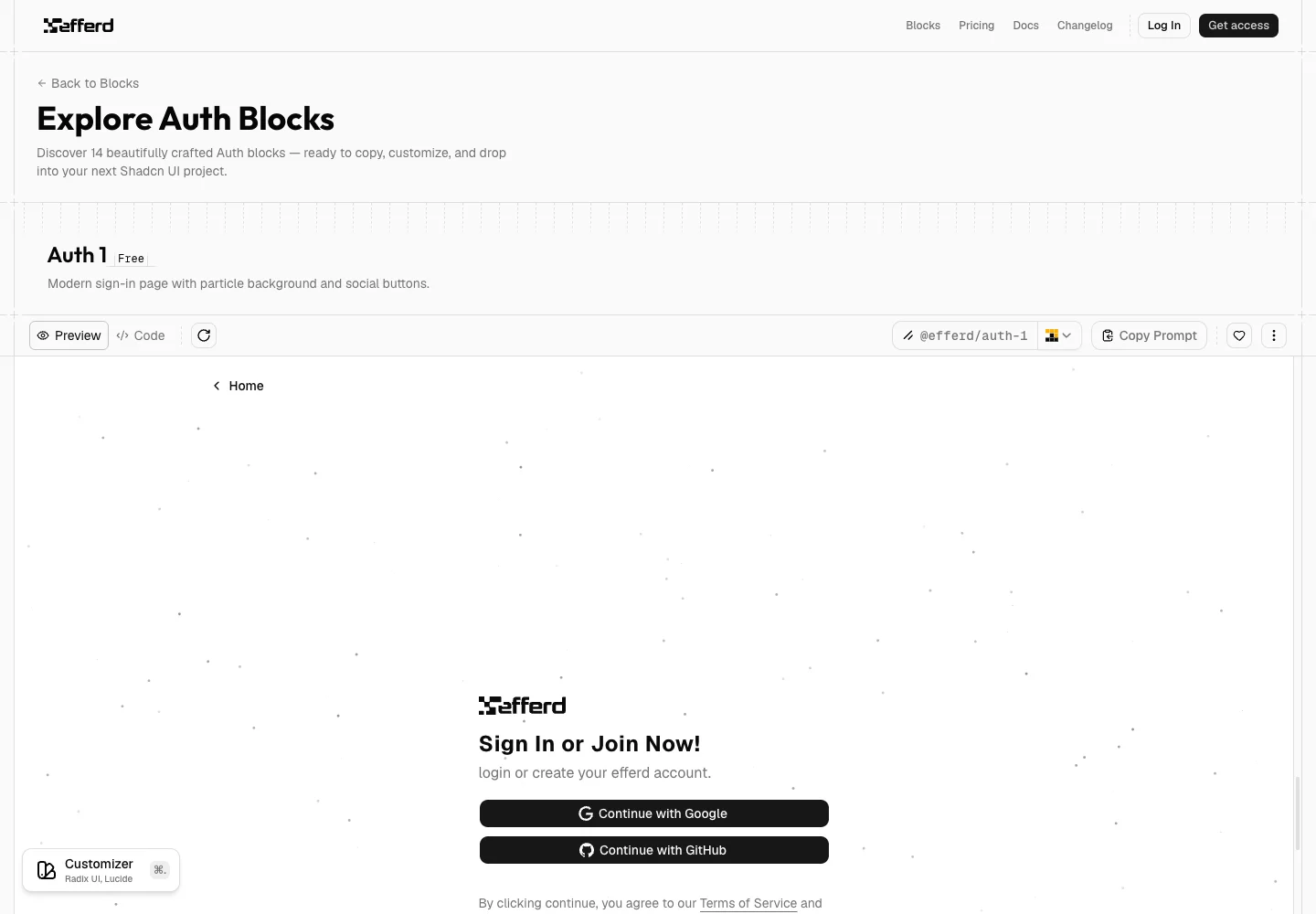
Shadcn Space: the library I paid for
Shadcn Space is my personal favorite when I want a website to feel more colorful.
I paid $99 for the lifetime plan I discuss in the walkthrough. I also emailed the founder and talked about the roadmap. Seeing new entries in the changelog gave me confidence that the collection was being worked on.
The filters are a big part of why I like browsing it. I can switch between free and paid choices and look specifically at marketing, ecommerce, or dashboard UI. I do not want to keep opening a preview only to discover that the thing I need is unavailable on my plan.
I especially like the hero sections and the admin dashboard I show in the video. Being able to preview the dashboard’s different screens helps me picture a larger application before I start building it.
That still leaves real work. A calendar layout does not implement scheduling rules, and a checkout design does not connect a payment provider. I use those screens as a frontend starting point.
My reason for buying was pretty simple. I liked the variety, I liked the way the site let me find things, and I wanted more color in the websites I was building. I can see myself using those pieces.
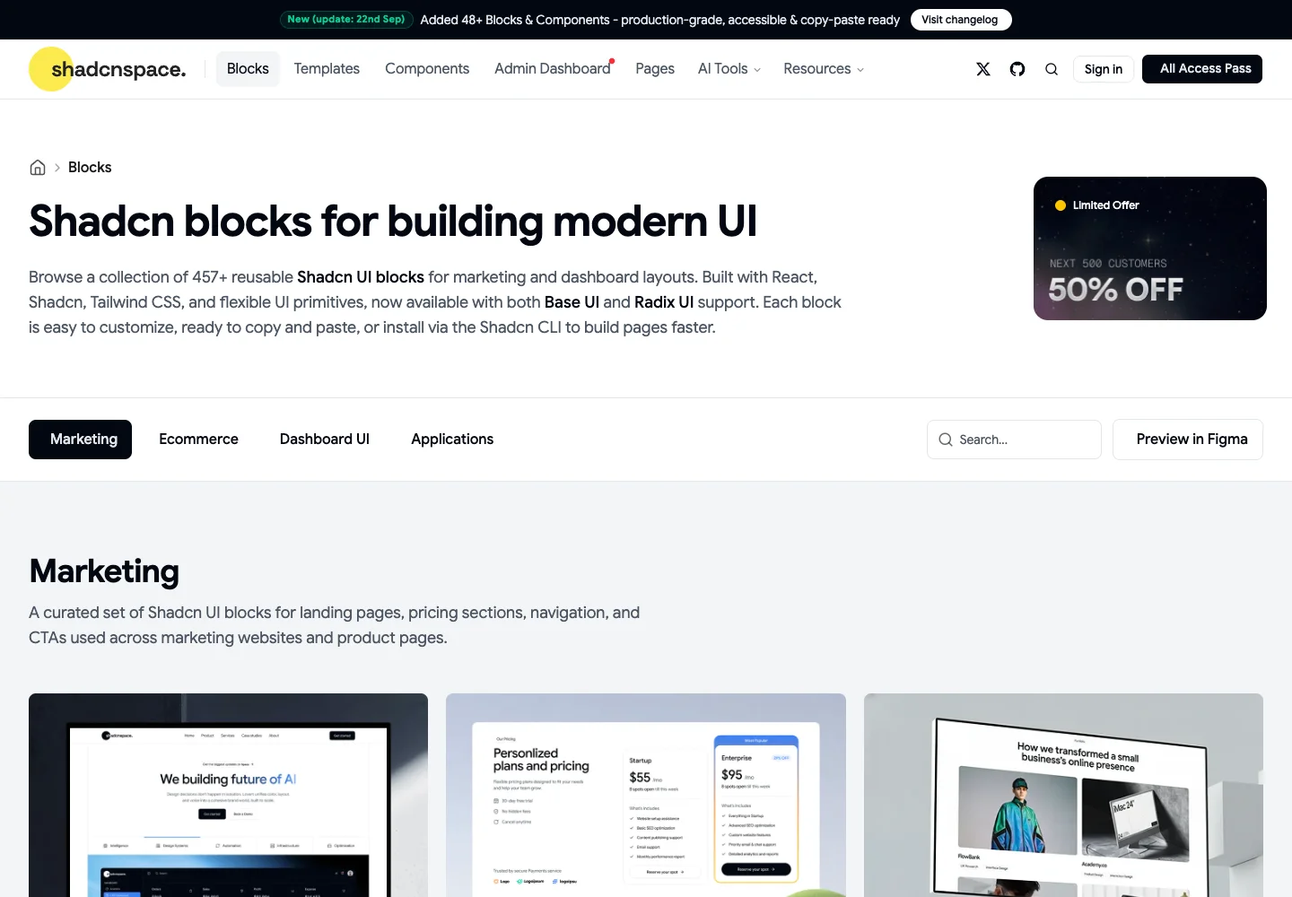
Shadcn Studio: a broad collection, especially if you are paying
Shadcn Studio is the option I would look at when I need a wider selection under one purchase. I like its templates and the range of layouts I can browse.
In the recording, I also call out its MCP integration. The official MCP documentation explains the setup. For someone using a coding assistant, that is worth considering alongside the visual collection. I would still check the generated changes in the project.
My frustration is the free browsing experience. When I filtered the hero sections during the walkthrough, the free selection felt much smaller than the overall catalog suggested. I do not enjoy getting excited about a whole collection and then discovering that most of what caught my eye needs an upgrade.
That is not an argument against paying. I think the paid designs look good. It means I would evaluate Studio as a paid purchase if those are the designs I want, rather than assume the free tier will give me the same range.
If you prefer choosing many sections from one collection, this is worth a close look. I would check the exact plan against the templates I need before deciding.
Launch UI: check which version you are downloading
Launch UI has some of the best-looking landing page previews in my shortlist. I especially like it for a SaaS product or a mobile application’s marketing page.
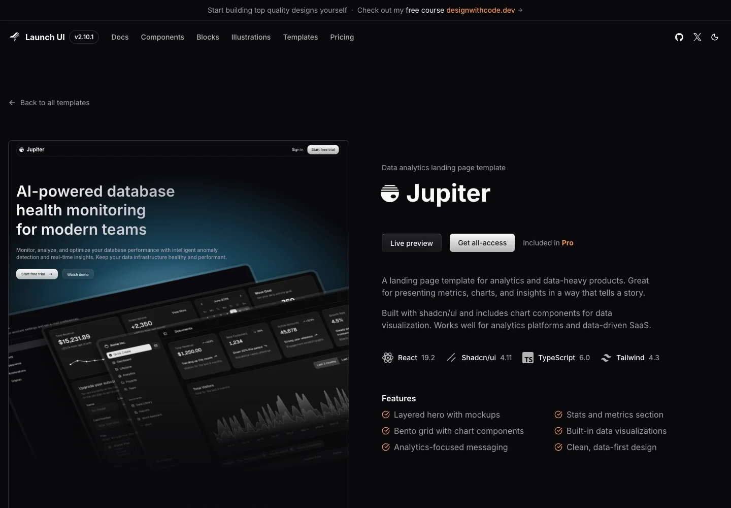
But I had a mismatch between what I expected and what I downloaded. After looking at the richer preview, I tried the free code and got a much simpler result: a hero with a single image, without the same animated presentation I had been looking at.
The Jupiter template I show in the video belongs to Pro. I wish that difference had been clearer while I was browsing.
I still like the work. If Jupiter is the design you want, evaluate the paid template on that basis. If you want a free starting point, look directly at the free template and make your decision from that preview.
That is the lesson I would take into every library on this list. Before paying or downloading, match the preview, the plan, and the actual files you will receive.
Which free shadcn landing page templates would I use?
I would look at Mainline by Shadcnblocks for a starting point with multiple pages, or Leo Miranda’s template for a single landing page. Sometimes I want a whole page to work from. I do not want to choose each section separately just to get a product waitlist online.
In the video, I talk about starting with a complete template, adding the product vision and screenshots, and giving interested people a way to join the waitlist. That is a practical way to start presenting a product while the application is still taking shape. I would connect the form and check that submissions actually arrive before sharing the page.
The first is Mainline, the free Shadcnblocks template. Its repository lists a landing page, About, Pricing, FAQ, Contact, and Login/Signup pages. It is a Next.js starting point with an MIT license. I like that it gives me a connected set of pages to adapt rather than a single isolated hero.
The other is Leo Miranda’s shadcn landing page. Leo is a friend and developer, and I like how approachable this template is. In the walkthrough, I look at its light and dark versions and sections for the team, testimonials, and pricing.
I would replace the example text, images, and icons with the product’s own material. I would also remove sections I cannot honestly fill. A template’s testimonial section is not a reason to invent testimonials.
How do shadcn library prices and catalog sizes compare?
Here is the comparison I promised in the video. Prices below are the USD amounts displayed on the official pages when checked on September 27, 2026. Discounts and catalogs change, and taxes may be extra. The source links go straight to each pricing page.
I have kept the vendors’ units separate. These are advertised counts, not a count of components I personally installed or tested.
| Library | Free starting point | Paid individual access | Advertised collection | What I would check before buying |
|---|---|---|---|---|
| Shadcn UI Kit | Starter is free | Pro: $79 one-time | Paid plan lists 314 premium blocks, 56 premium examples, 3 premium templates | Whether the changelog or page I want is included; Pro is for 1 user |
| Efferd | Free blocks | Pro: $147 one-time | 183+ layouts/blocks | The specific blocks I need; Team is a separate purchase |
| Shadcn Space | Free collection | Starter: $49/month or $99 lifetime; Pro: $149 lifetime | Pricing catalog lists 457+ blocks, 456+ components, 12+ templates, 28+ pages | Which items my plan unlocks; catalog totals are not a promise of Starter access |
| Shadcn Studio | Community is free | Basic: $99 one-time; Pro: $199 one-time | Page advertises 1,000+ blocks, 1,000+ components, 100+ pages, 25+ templates | Plan-specific access and whether I need Pro's inclusions |
| Launch UI | Free starter | Pro: $99 one-time, plus local taxes | Pro lists 7 templates, 74 blocks/sections, 23 illustrations, 15 animations | That the template in the preview is the one included in my download |
Shadcn Space also uses a smaller combined count elsewhere on its pricing page. I have used the separate catalog figures above rather than trying to reconcile the site’s marketing totals myself. That inconsistency is another reason I would browse the actual collection before comparing libraries by size.
I would not divide price by component count and call the cheapest result the best value. One useful changelog page can be worth more to me than hundreds of variations I will never use. For a team, the number of licensed users matters too. The individual prices above are not team licenses.
How I would use these without making another generic website
I would choose the visual direction first, find the few blocks that fit, and adapt them to the real content. That is how I would keep reuse from turning into a random collection of sections.
For example, if I am putting up a waitlist page, I want the hero to explain the product, the screenshots to show something real, and the signup to work. I probably do not need a dashboard template, an enormous feature grid, and six animation styles to do that job. The harder question is whether the page gives someone a reason to care. My guide to validating a startup idea goes deeper into that part.
For an application, I would look at the repeated interactions before the decorative sections. Can I adapt the navigation and forms? What happens when a table is empty? Does the mobile menu work with a keyboard? How will long labels look? I would test those things in the finished project, even if the original demo looks polished.
I also want the framework choice settled before importing a template. At Sparkable, my current preference is Astro for content-led websites and TanStack for interactive applications. Those are working preferences, not requirements for using shadcn. A Next.js template may contain framework-specific routing or image code that needs adapting elsewhere. I would read those dependencies before treating it as a drop-in starting point. My MVP tech stack guide covers the broader application decisions around the UI.
The same applies to AI coding tools. I would give the agent the chosen components, the design direction, and the behavior I need. I still have to decide what belongs on the page and check the result. The source code being available makes editing easier; it does not make every generated change correct.
I want boring websites to feel good. Sometimes that means starting with a colorful Shadcn Space section. Sometimes the quieter layout from Shadcn UI Kit is the better fit. My taste is a starting point, and the product still gets the final say.
Sources and further reading
My hands-on opinions come from the walkthrough embedded above. I checked the following official resources for product details, links, and the pricing snapshot:
- shadcn/ui documentation and project builder.
- Shadcn UI Kit pricing and plan inclusions.
- Efferd pricing.
- Shadcn Space pricing and catalog figures.
- Shadcn Studio pricing.
- Launch UI pricing and Jupiter template.
- Shadcnblocks and Leo Miranda’s landing page source.
Frequently asked questions
Where would I find free shadcn blocks and templates?
I would start by browsing Efferd and Shadcn Space for the specific blocks I need. For a whole landing page, I would also look at Leo Miranda’s free template. I would evaluate the free preview itself, because the paid demo may contain sections that the download does not include.
Which shadcn library would I choose for a dashboard?
I would start with Shadcn Space because I like the admin dashboard I preview in the video. Efferd’s app shells would be another place to look for the surrounding layout and navigation. I would compare those screens against the application’s real workflows before choosing either.
Is shadcn/ui the same as Shadcn Studio or Shadcn Space?
No. I use shadcn/ui as the underlying component foundation, while these separate products offer their own blocks, templates, and tools around that ecosystem. Each third-party collection has its own pricing and license.
Which library did I pay for?
I paid $99 for the Shadcn Space lifetime plan discussed in the video. I liked its visual variety, free and paid filters, and the updates I was seeing. I would still check the current plan inclusions before recommending that someone buy it today.
Is Launch UI’s Jupiter template free?
Jupiter is listed as a Pro template. When I tried the free download, it was simpler than the richer preview I had been looking at. I would check the template’s own listing before expecting the same design from the free starter.
Do these templates give me a working application?
I treat them as a frontend starting point. A login screen still needs authentication, a waitlist needs somewhere to store submissions, and an application needs its own data and permissions. I would budget time for that integration and for testing the finished experience.